Conrad Electronic, 2025
Ten initiatives came out of the function and were measured across the EU over their first twelve months.
| Initiative | EU revenue impact, first 12 months | How it was measured |
|---|---|---|
| SERP: Vertical Filter | €3,800,000 | A/B test |
| SERP: Table view | €2,800,000 | +6.15% revenue per visit, +2.71% orders · 5-week A/B test, B2B segment |
| SERP: Header | €1,000,000 | A/B test |
| PDP: Hierarchy | €4,900,000 | A/B test |
| PDP: Technical view | €3,400,000 | A/B test |
| PDP: Delivery information | €1,900,000 | A/B test |
| Cart: Declutter | €5,000,000 | +5% revenue per visit · pre-launch A/B test |
| Cart: Empty State | €1,500,000 | A/B test |
| Delivery promise | €4,380,000 | +8.8% revenue per visit · A/B test per sub-initiative |
| Cookie banner | €1,650,000 | Modelled · +15.77pp consent acceptance, sequential A/B/n, Nov 2024 to Mar 2025 |
| Total | €30,330,000 |
Nine of the ten are A/B test results, which is the part that matters when someone checks. These are not attributed revenue or a modelled uplift; a variant ran against a control and the difference is the number. The cookie banner is the single exception and the table marks it as modelled.
These are first-year figures and every one of these surfaces is still live, so the total is a floor on what they have earned since.

One of the ten. The delivery promise on a product page, which is the surface behind the 8.8 percent. The line under the badge counts down the hours left to order and still get it tomorrow.
The spread matters more than the total. Ten separate surfaces, from a consent banner to a delivery promise to a filter panel, each improved on evidence and each measured, is what a working function looks like from the outside. One large redesign would say much less, and it would not be repeatable.
Three of them sit on the product detail page: technical view, information hierarchy and the cut-off time for delivery. That is not three attempts at the same idea. It is what happens when a team can see, in a repository, that professional buyers arrive needing to answer three different questions before they order, and can then answer each one separately.
The cookie banner is the one to look at twice. A consent dialog is usually treated as a legal artefact and designed by nobody. It is also the gate on analytics consent, and analytics consent is what paid search targeting runs on, so more people accepting means better performance on the same budget. The €1.65M is performance marketing’s calculation of the revenue from those additional consenting users, which makes it the one modelled figure in the table. Nobody asks for that work. It gets found when a function looks at the whole journey, which is what the roadmap never covers.
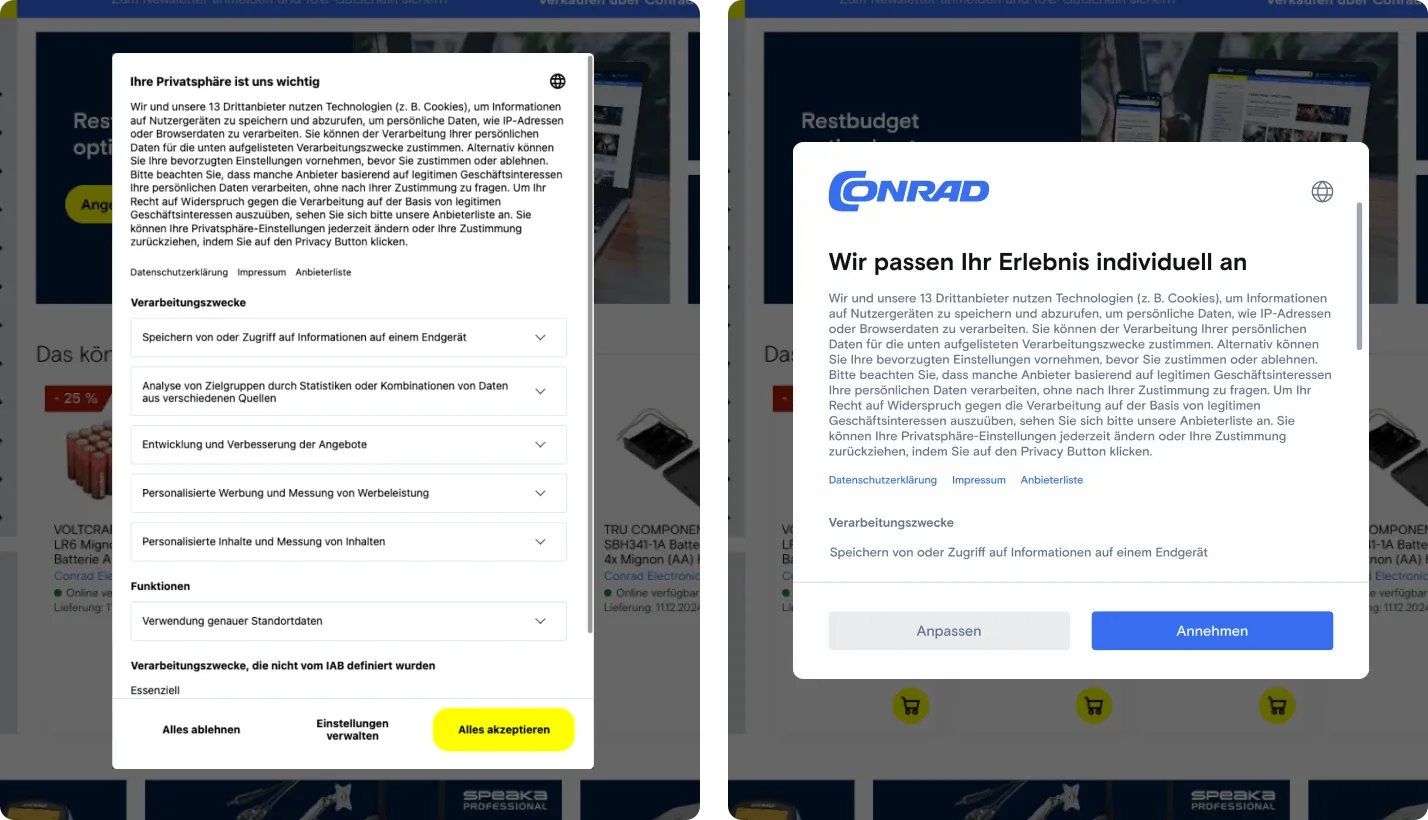
The dialog before and after. Same information, same thirteen third parties, and a 15.77 point difference in how many people accepted.
Decisions
One place where the design argument changed what was going to happen.
Treat the consent dialog as a revenue surface. Planned: nothing, beyond a goal handed over: raise the acceptance rate. Argued: a goal with no plan behind it gets solved by nudging. The dialog gates the analytics that performance marketing spends against, and the same thirteen third parties can be presented in a way people are willing to say yes to. So the work was a design problem on the whole journey, measured as a revenue one, with performance marketing asked up front what an additional consenting user is worth. Happened: a sequential A/B/n test from November 2024 to March 2025, 15.77 points more acceptance, and a figure performance marketing stands behind. It is the one modelled number in the table and it is marked as such.
The bets that carry no number yet
A revenue table is the easy half, because optimization work reports itself. The harder half is the decisions a company makes once, at the top, where the result arrives years later or never arrives as a clean figure at all. The function supported four of those, each with evidence behind it:
- A single-creditor invoicing model, so every order is invoiced by Conrad regardless of which seller fulfils it. A change to marketplace logic made for a buyer who has to reconcile invoices against purchase orders.
- The Conrad PRO loyalty program for professional buyers, where the thing being rewarded is procurement behavior and not consumer frequency.
- The post-purchase email redesign, the part of a B2B order that a buyer forwards to someone else in their own company.
- The homepage redesign, the one bet that shipped whole, with no slicing, and the reason a company-wide transformation is now funded for 2026.
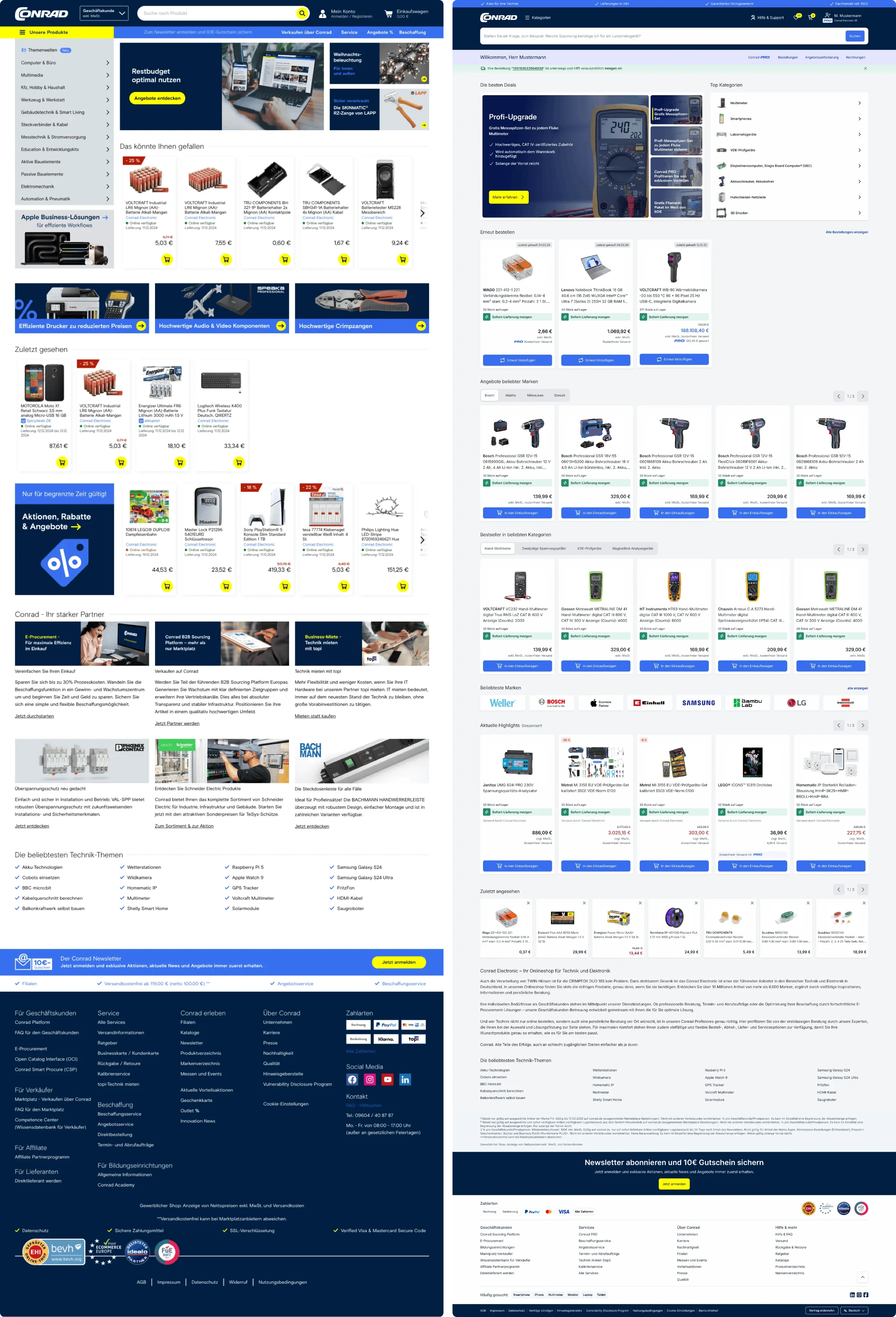
The homepage before and after. A carousel of recently viewed consumer goods becomes a reorder row: the date each item was last bought, stock on hand, a delivery promise, PRO pricing, and a button that adds it again. The same logic runs down the rest of the page.
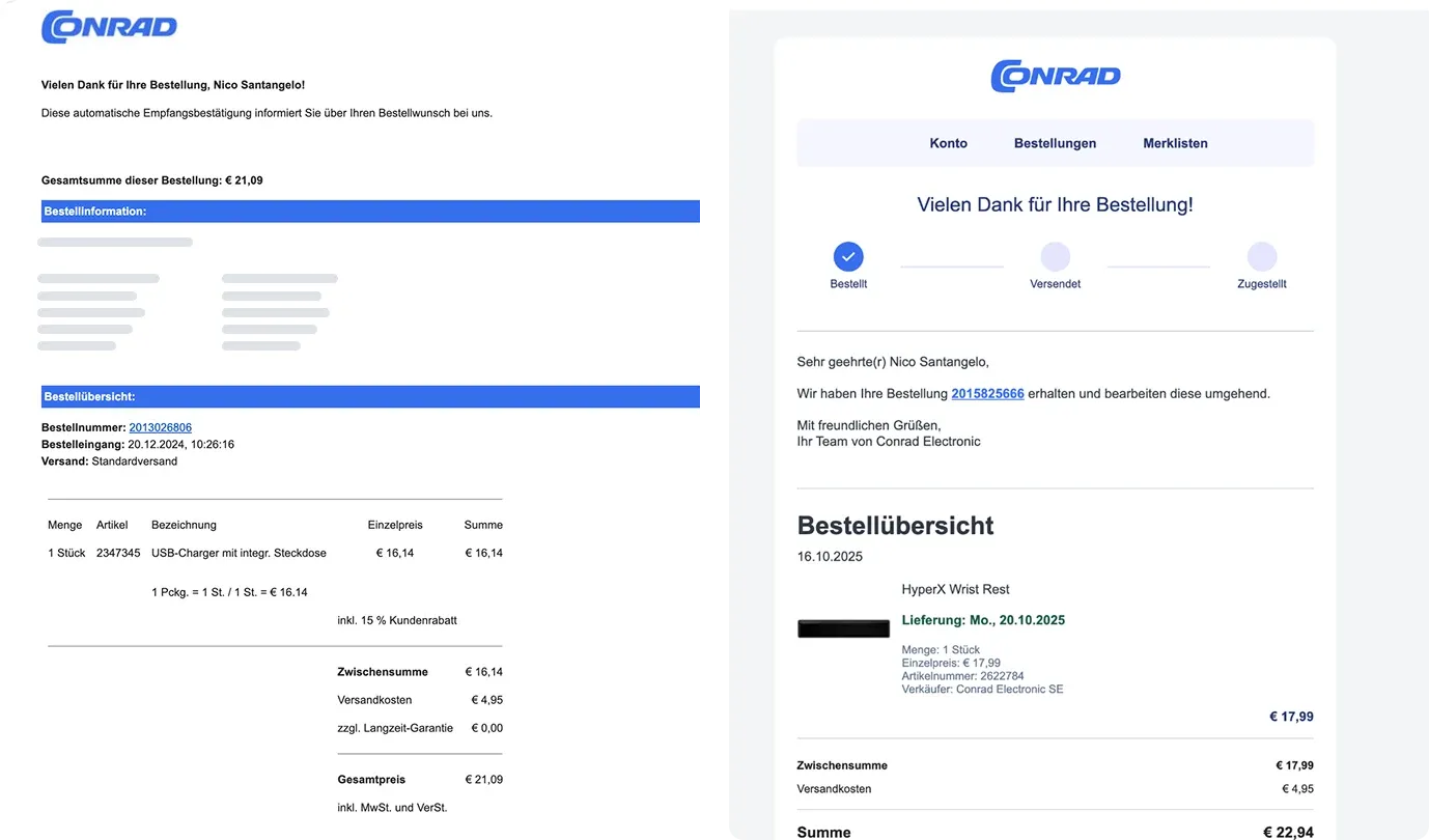
The post-purchase email before and after. It carries a progress tracker now, because the thing a buyer wants from this message is to know where the order is without logging in.
Two further pieces of research set the baseline for company-level decisions above product level. Neither is mine to announce. That they were commissioned at all is the point: a research function becomes useful to a board when it can take the questions that have no product owner.
On all of these the function supplied the evidence and the design. Other people owned the decisions, which is the honest version and also the more useful one: a research function that claims the decisions is not a function anyone wants to work next to.